LVAM
Brand guidelines
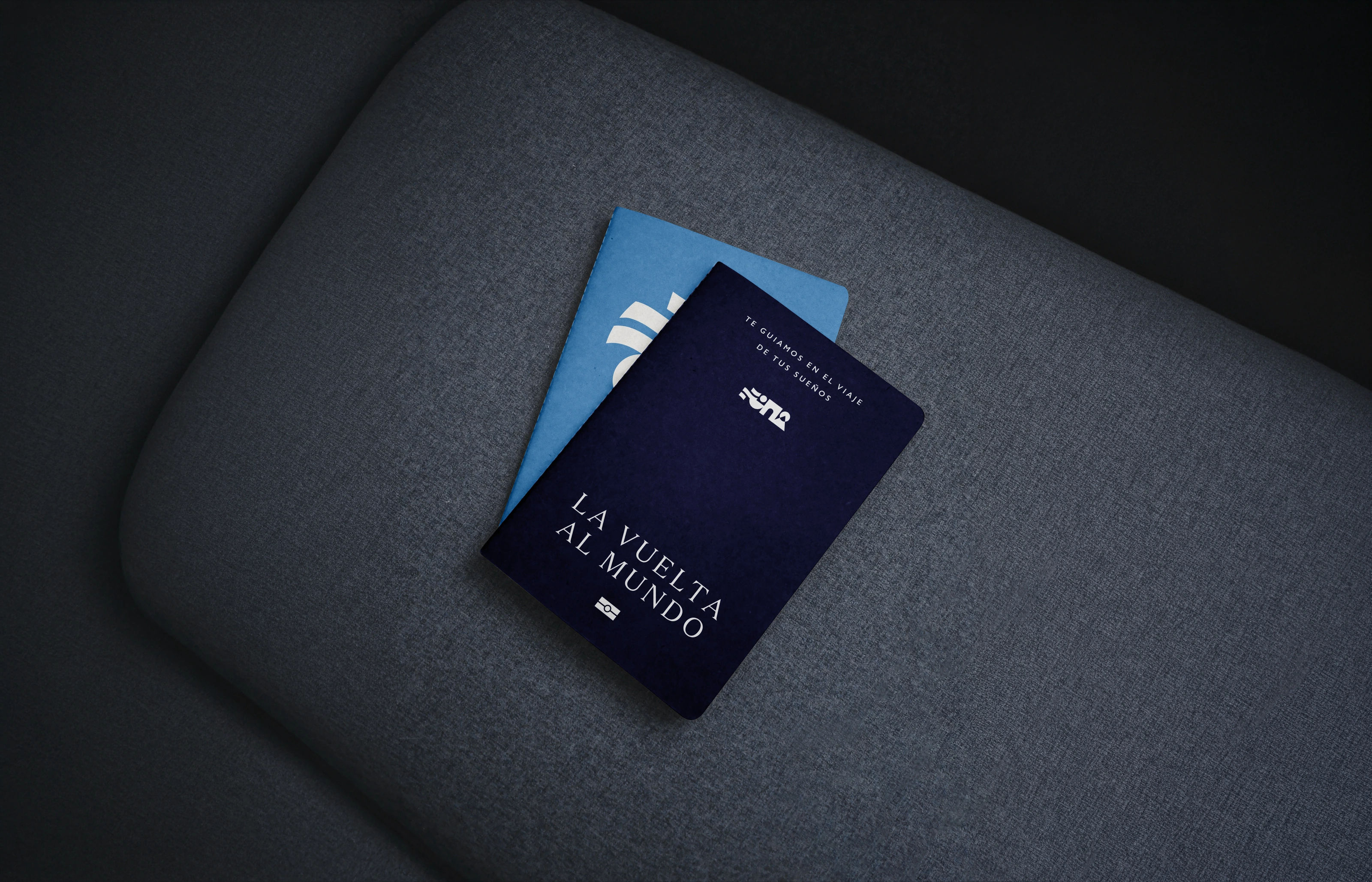
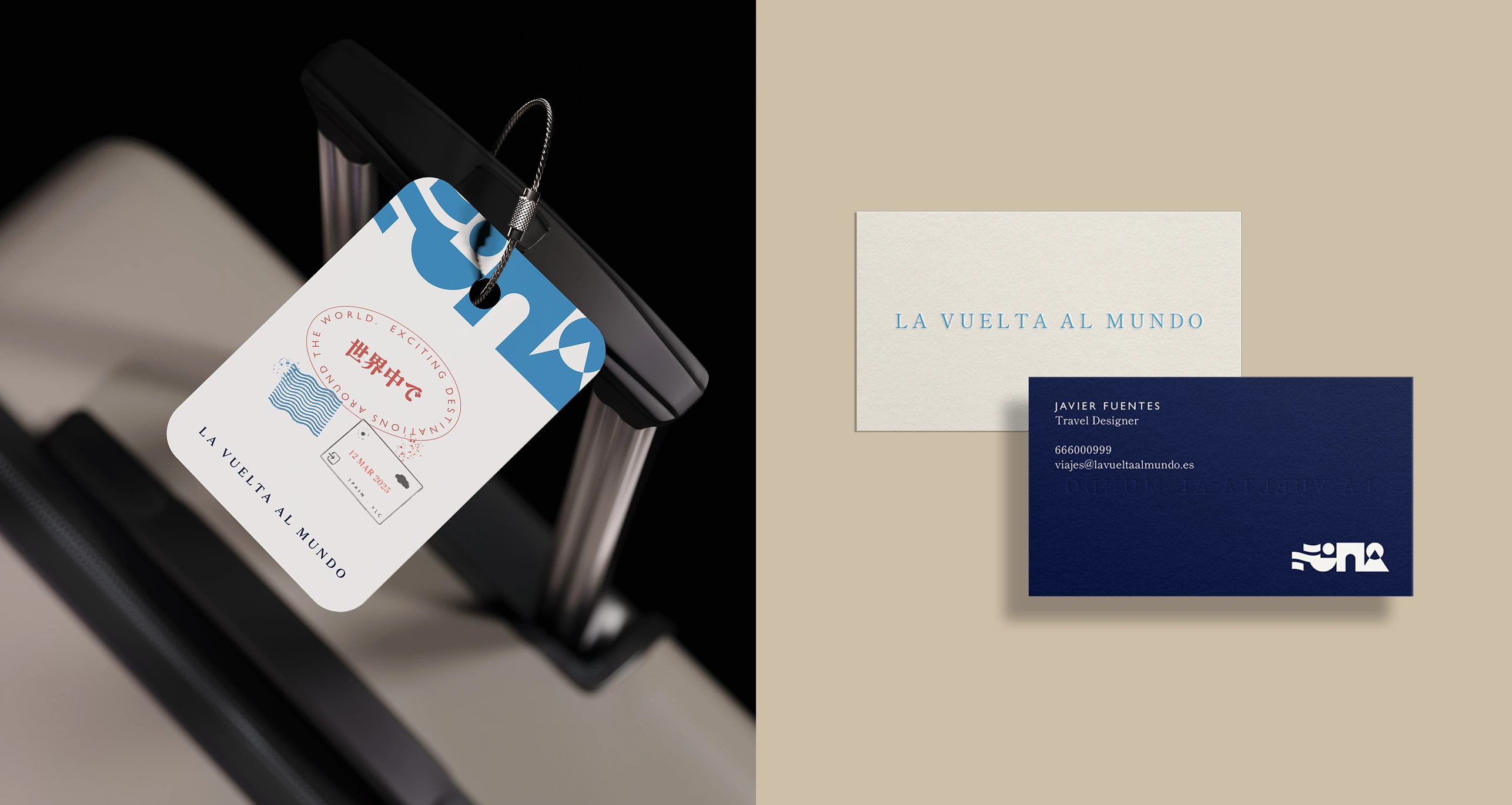
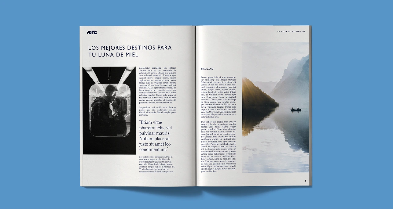
La Vuelta al Mundo (LVAM) is a contemporary travel agency specializing in curated, organized experiences for young newlyweds, while remaining accessible to all passionate travelers. They needed a comprehensive visual identity that broke away from generic travel agency tropes, leaning instead into a sense of adventure, closeness, and modern trust.
The travel sector is saturated with cliché imagery (airplanes, globes, and generic compasses). The goal for LVAM was to establish a unique, premium, yet highly accessible visual language that evokes the emotional and physical texture of modern exploration without relying on industry commonplaces.
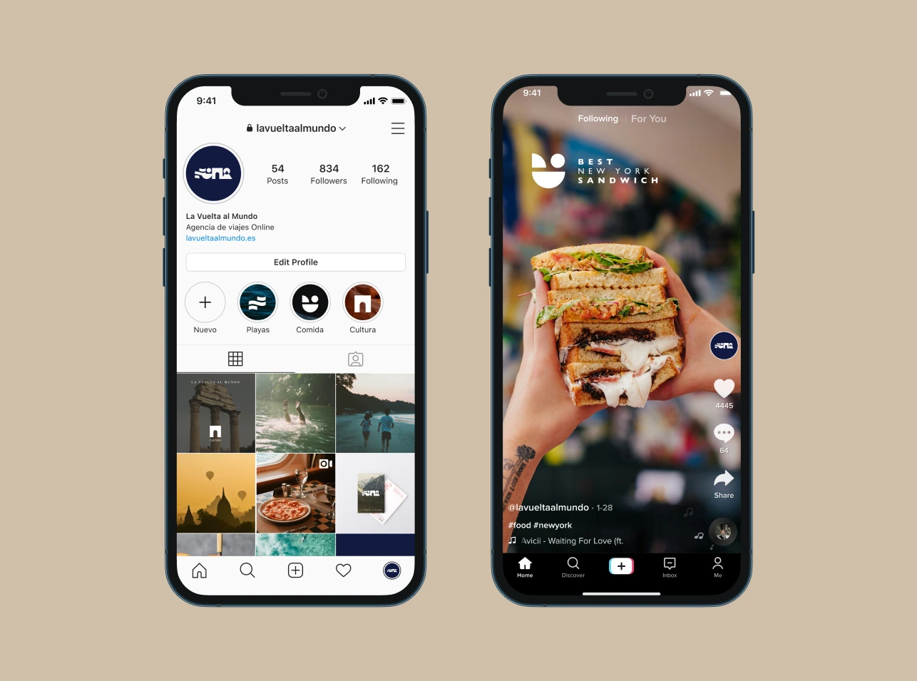
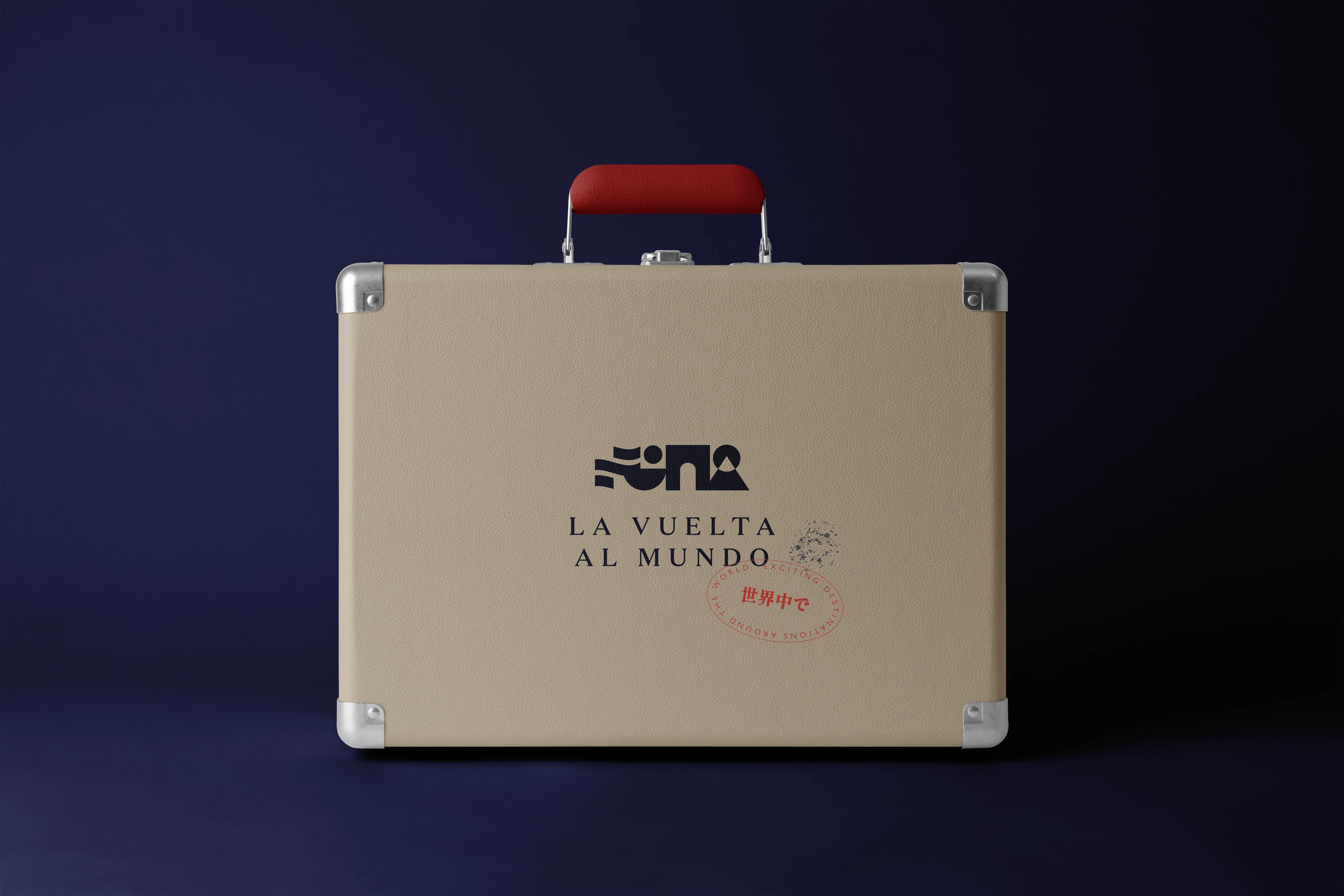
Steering clear of standard travel design clichés, we built "La Travesía", a modular visual concept based on geometric abstraction. The core mark breaks down into four essential experience modules: Mar, Gastro, Cultura, and Montaña. These icons serve a dual purpose: they live together as a cohesive logo lockup and separate to act as standalone functional wayfinding graphics across web, app interfaces, and editorial slide decks.