Paddle
Brand design
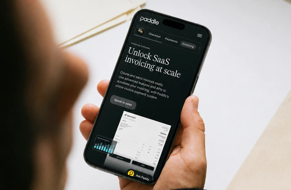
Over a four-year tenure as an in-house Brand Designer at Paddle, I touched nearly every facet of the brand's visual identity. Working embedded within the design team and in lockstep with marketing, I helped evolve Paddle’s brand from the ground up, translating complex technical and corporate narratives into engaging, high-impact visual systems.
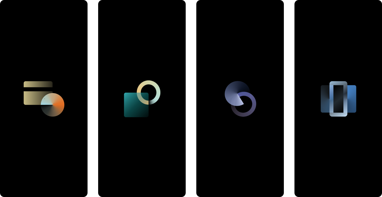
Following Paddle’s acquisition of ProfitWell, I led the visual rebranding of four newly integrated products. I designed the new logos and iconography systems, creating a unified visual architecture that aligned with Paddle’s parent brand while giving each product a distinct, functional identity.



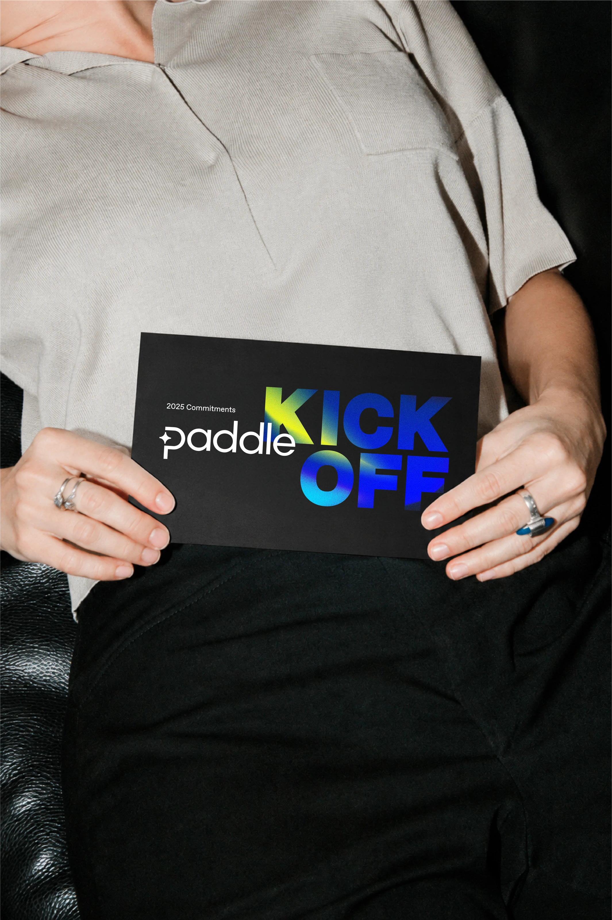
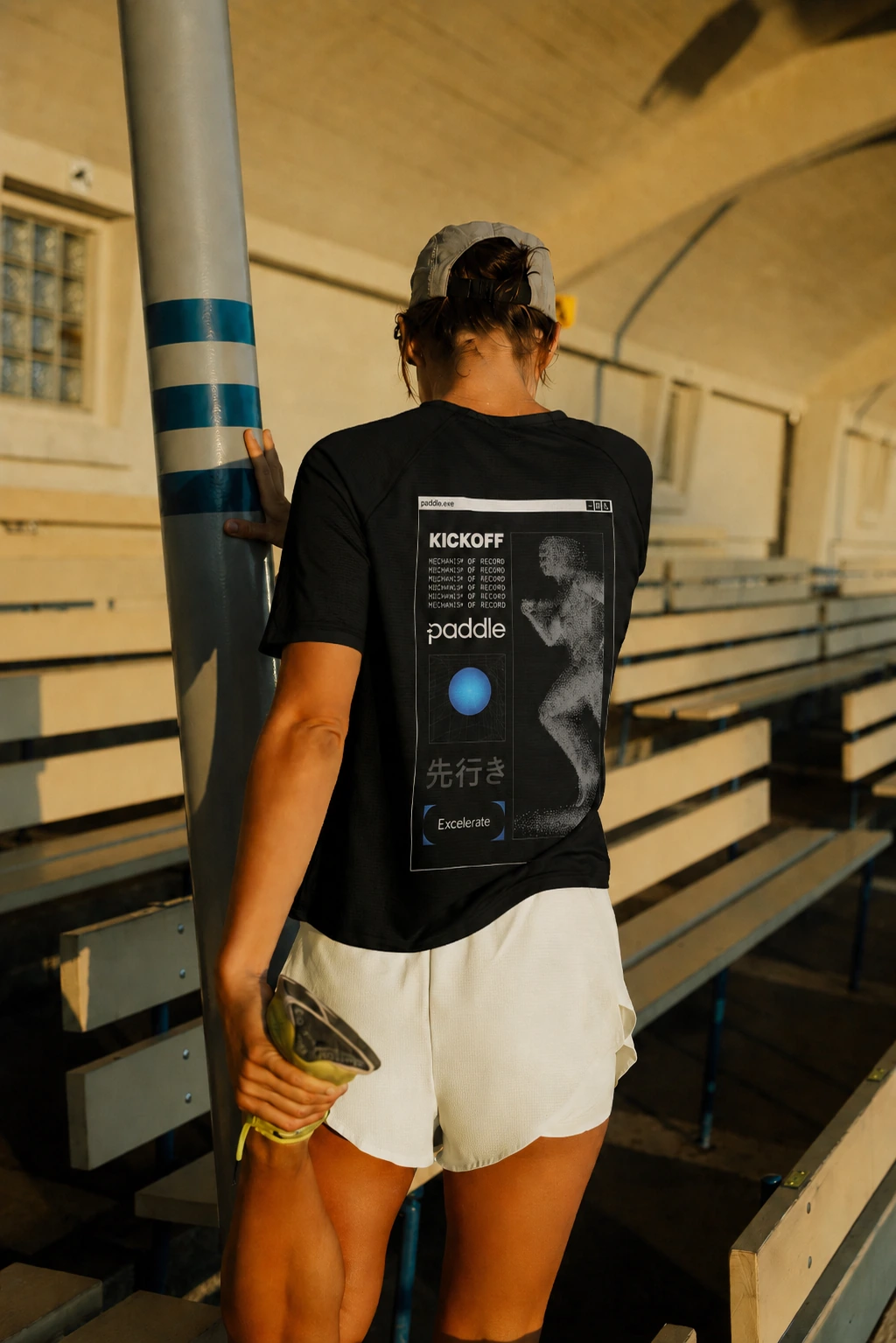
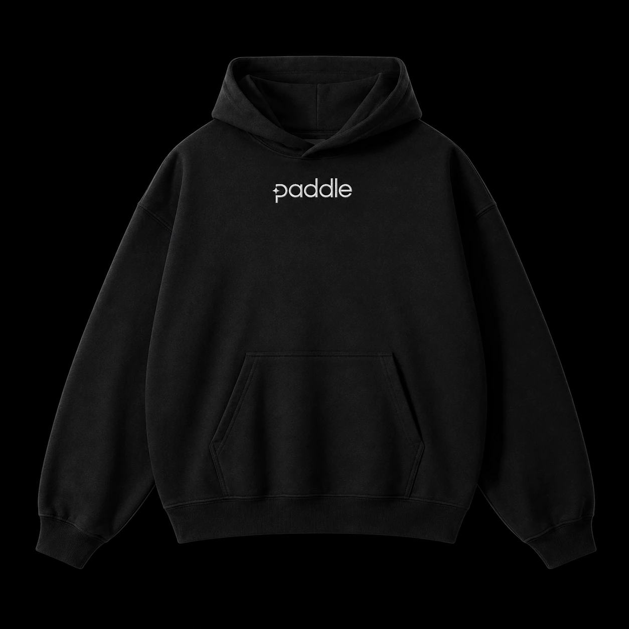
Brand identity is lived. For Paddle’s flagship internal event, I took creative ownership of the entire physical and visual experience. From large-scale environmental vinyls and stage design to the smallest piece of custom apparel, every touchpoint was designed to build alignment and energy.

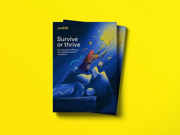
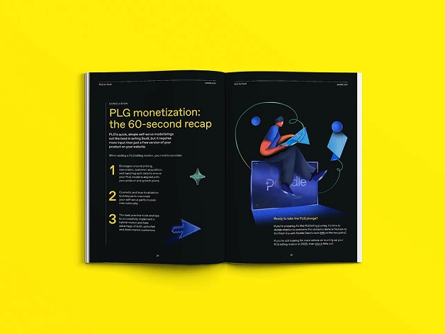
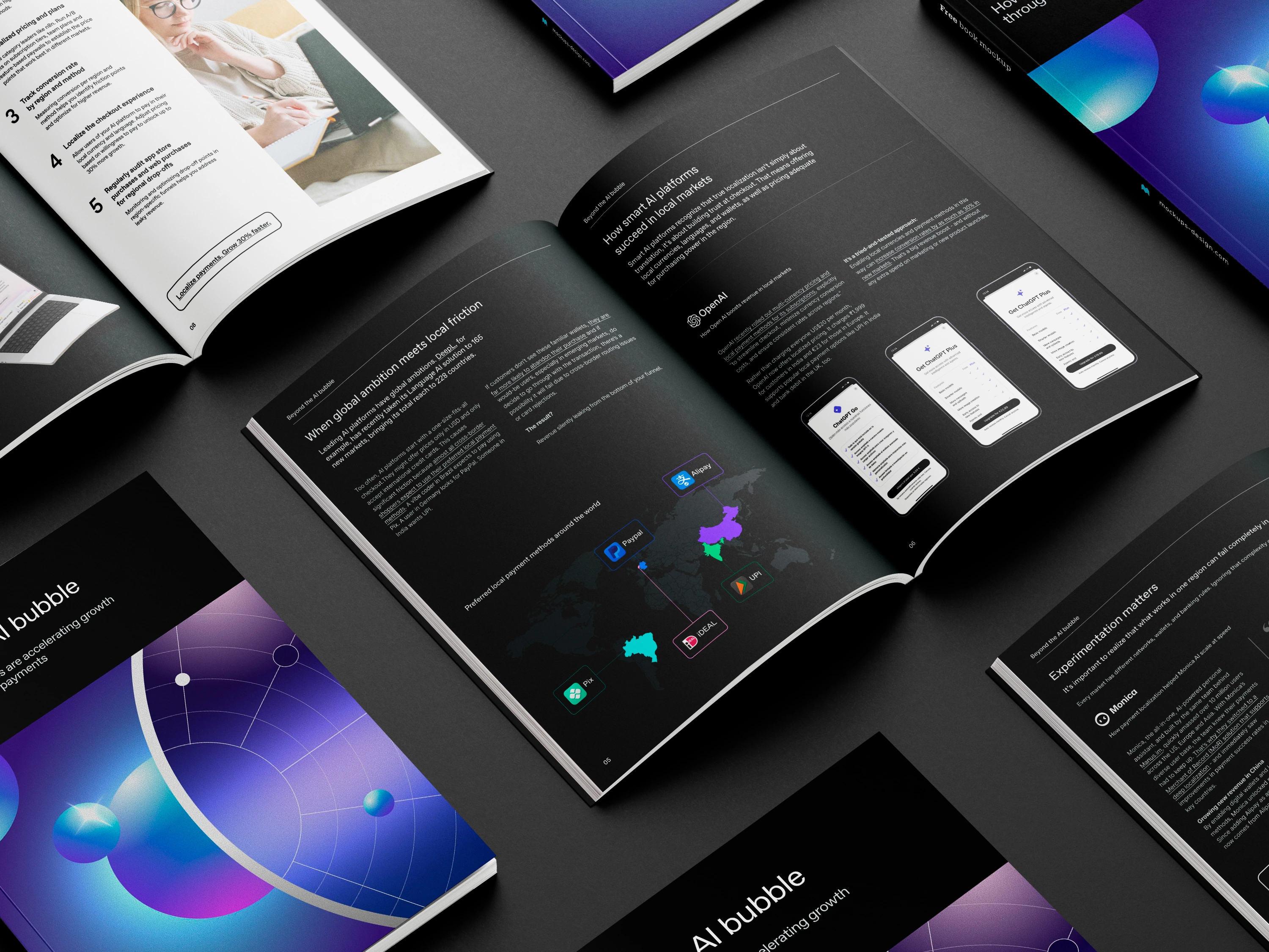
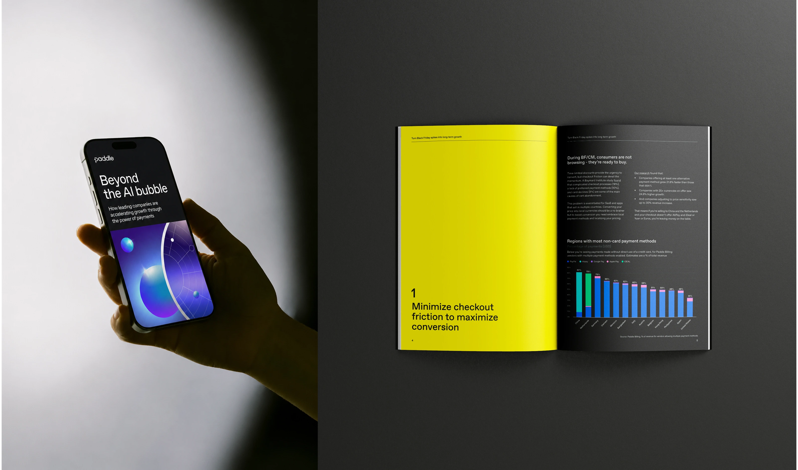
To support a growing need for educational and marketing content, my team and I created a scalable design template for Paddle’s guides. The system brought together reusable layouts, components, and visual principles, allowing us to speed up production while maintaining a high level of consistency and craft. It turned guide creation into a smoother, more repeatable process without losing the flexibility needed for each piece of content.
As the brand scaled, so did our output. I acted as a design guardian, onboarding and steering external contractors and agencies. By providing clear creative direction and contextualizing our brand guidelines, I ensured all outsourced work maintained visual integrity while empowering external teams to do their best work.